Compose 4 GTK
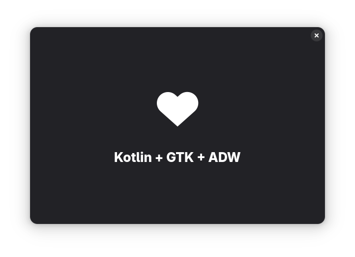
Compose 4 GTK is a Kotlin library that brings the Jetpack Compose-style declarative UI development model to native Linux applications using GTK 4 and Libadwaita (Adw).
With this library, developers can build modern, responsive desktop applications in Kotlin, combining the power of Compose with the native capabilities of GTK.
Benefits for Users
Applications built with Compose 4 GTK integrate seamlessly into GNOME, offering a look and feel consistent with other GTK applications.
They are customizable, accessible, and performant—leveraging modern APIs like Wayland and the latest optimizations from the GTK ecosystem.
Benefits for Developers
Building dynamic UIs with Compose 4 GTK is simple, consistent, and predictable.
You write UIs using declarative, stateless, and side-effect-free functions, letting the framework manage the creation, updating, and destruction of GTK widgets automatically.
Jetpack Compose is the default and recommended UI framework for Android—and now, with Compose 4 GTK, you can bring that same declarative power to the Linux desktop.
Getting started

This library is still under development. Pre-release versions are available on Maven Central.
JDK 22 or newer and the Kotlin Compose compiler plugin are required.
For example, on your build.gradle.kts:
plugins {
    kotlin("jvm")
    id("org.jetbrains.kotlin.plugin.compose")
    application
}

kotlin {
    jvmToolchain(22)
}

repositories {
    mavenCentral()
    google()
}

dependencies {
    implementation("io.github.compose4gtk:compose-4-gtk:<latest-version>")
}

application {
    mainClass = "org.example.MainKt"
    applicationDefaultJvmArgs = listOf("--enable-native-access=ALL-UNNAMED")
}More information on how to set up the Compose compiler plugin on the official documentation.
Examples
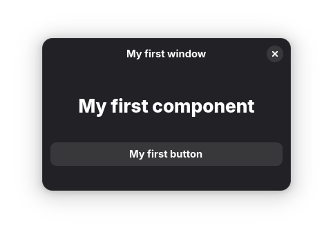
Basic window
Source here.
A window with a header, some text, and a button:
fun main(args: Array<String>) {
    adwApplication("my.example.hello-app", args) {
        ApplicationWindow("My first window", onClose = ::exitApplication) {
            Box(orientation = Orientation.VERTICAL) {
                HeaderBar(modifier = Modifier.cssClasses("flat"))
                StatusPage(title = "My first component") {
                    Button("My first button", onClick = { println("Clicked!") })
                }
            }
        }
    }
}This first example highlights the structure of Compose 4 GTK projects:
a call to
adwApplicationto initialize the applicationone or more
ApplicationWindowseveral nested widgets that make up the window content
All the declarations above (e.g. ApplicationWindow, Box, HeaderBar, etc.) are function calls that take care of creating, updating and destroying the native GTK/ADW widgets.
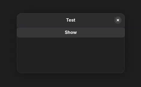
Dynamic window
Source here.
An interactive button that shows or hides a label when pressing a button:
fun main(args: Array<String>) {
    adwApplication("my.example.hello-app", args) {
        ApplicationWindow("Test", onClose = ::exitApplication) {
            Box(orientation = Orientation.VERTICAL) {
                HeaderBar()

                var show by remember { mutableStateOf(false) }
                Button(
                    label = if (show) "Hide" else "Show",
                    onClick = { show = !show },
                )
                if (show) {
                    Label("A random label that can be hidden")
                }
            }
        }
    }
}This example demonstrates stateful UI in Compose:
Application state is stored in an observable container — here,
remember { mutableStateOf(false) }.The UI reacts to changes in state, dynamically creating or removing components using Kotlin’s control flow (
if (show)).
You can read more about how to handle application state in the official Compose documentation, although some concepts only apply to Android.
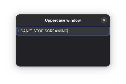
Entry with text transformation
Source here.
An Entry, that will transform the text to be in uppercase:
fun main(args: Array<String>) {
    adwApplication("my.example.hello-app", args) {
        ApplicationWindow("Uppercase window", onClose = ::exitApplication) {
            Box(orientation = Orientation.VERTICAL) {
                HeaderBar()

                var text by remember { mutableStateOf("") }
                Entry(
                    text = text,
                    placeholderText = "All text will be uppercase",
                    onTextChange = { text = it.uppercase() },
                )
            }
        }
    }
}This example highlights one of the main properties of Compose: the state is owned by your app, and not by the GTK Widgets.
This means that the source of truth for what the text should be is the text variable.
Since we ensure only uppercase strings are assigned to text, we're guaranteed that the Entry will only contain uppercase text.
See the official Compose documentation for more details.
Dynamic tags
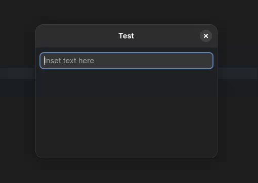
Source here.
fun main(args: Array<String>) {
    adwApplication("my.example.hello-app", args) {
        ApplicationWindow("Test", onClose = ::exitApplication) {
            ToastOverlay {
                VerticalBox {
                    HeaderBar()

                    HorizontalClamp {
                        VerticalBox {
                            var text by remember { mutableStateOf("") }
                            Entry(
                                text = text,
                                onTextChange = { text = it },
                                placeholderText = "Inset text here",
                                modifier = Modifier.margin(margin = 8),
                            )
                            FlowBox(homogeneous = true) {
                                val tokens = text.split(' ').filter { it.isNotBlank() }
                                for (token in tokens) {
                                    Button(token, modifier = Modifier.margin(margin = 8), onClick = {
                                        dismissAllToasts()
                                        addToast(Toast.builder().setTitle("Clicked on $token").build())
                                    })
                                }
                            }
                        }
                    }
                }
            }
        }
    }
}This example is a more advanced version of the same concepts explained above:
the entire state of the application is stored in
var textthe
Entry'sonTextChangeupdatestextas the user typesButtonsare added to the UI tree by simply iterating over the split words.
As a bonus, this example also illustrates how to show toasts using ToastOverlay.
ListView
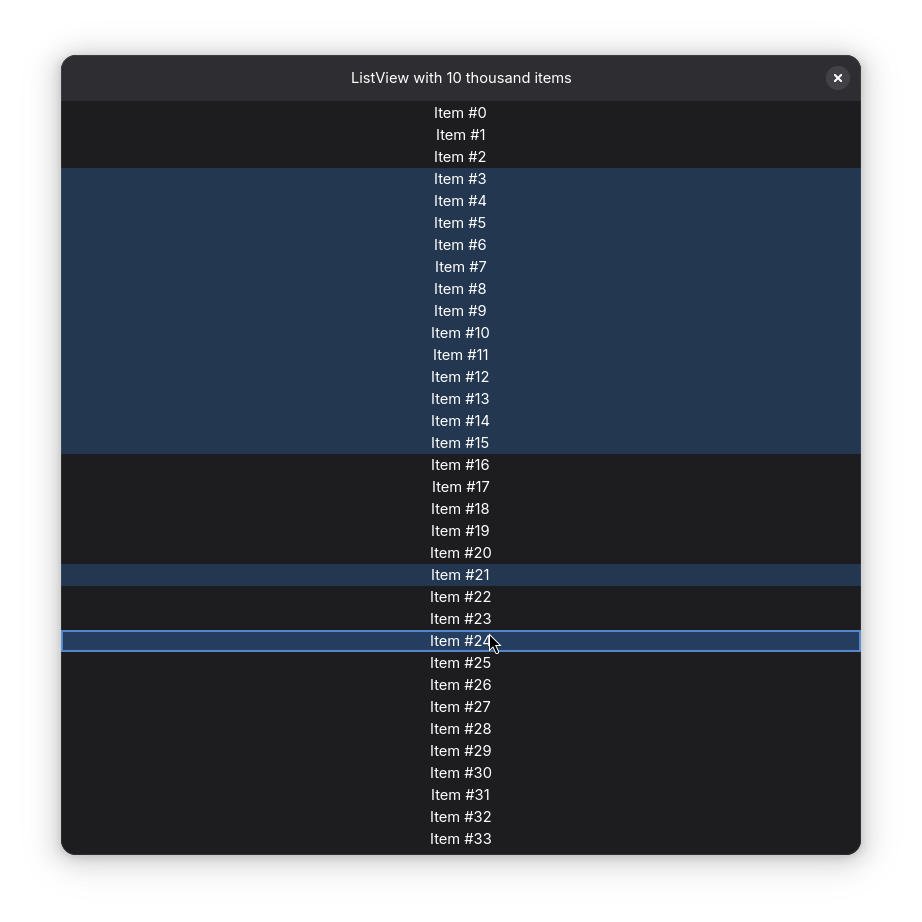
Source here.
fun main(args: Array<String>) {
    adwApplication("my.example.hello-app", args) {
        ApplicationWindow("Test", onClose = ::exitApplication, defaultWidth = 800, defaultHeight = 800) {
            VerticalBox {
                HeaderBar(title = { Label("ListView with 10 thousand items") })
                ScrolledWindow(Modifier.expand()) {
                    ListView(
                        items = 10000,
                        selectionMode = SelectionMode.Multiple,
                    ) { index ->
                        Label("Item #$index")
                    }
                }
            }
        }
    }
}This example explains how to declare a ListView with 10 thousand items. Items are created, reused, updated and destroyed dynamically as the list scrolls.
There are alternative options to create a ListView, see the full documentation.
GIO Resources
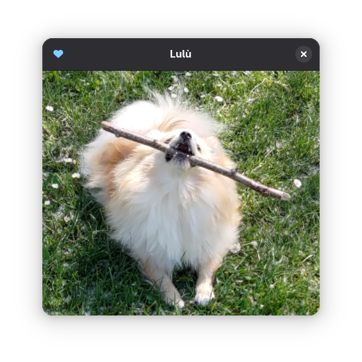
Source here.
fun main(args: Array<String>) {
    useGioResource("resources.gresource") {
        adwApplication("my.example.hello-app", args) {
            ApplicationWindow("Lulù", onClose = ::exitApplication, defaultWidth = 400, defaultHeight = 400) {
                VerticalBox {
                    HeaderBar(
                        startWidgets = {
                            IconButton(
                                // The vector icon is embedded into the gresources file
                                icon = ImageSource.Icon("heart-filled-symbolic"),
                                // The "accent-colored" CSS class is defined in the gresources file
                                modifier = Modifier.cssClasses("accent-colored"),
                                onClick = { println("TODO: pet the dog") },
                            )
                        },
                    )
                    Picture(
                        // The image is embedded into the gresources file
                        ImageSource.forResource("/my/example/hello-app/images/lulu.jpg"),
                        contentFit = ContentFit.COVER,
                        modifier = Modifier.expand(),
                    )
                }
            }
        }
    }
}This example demonstrates how to load and use resources packaged in GIO resource bundles:
useGioResource(a non-composable helper function) loads theresources.gresourcefile from the JAR’s resources and makes it available throughout the applicationImageSource.Icon,ImageSource.forResourceandModifier.cssClassesare examples of how to reference resources loaded via the GIO bundle
For this example, resources.gresource was compiled with glib-compile-resources, and bundled into the JAR. See the build.gradle.kts for more details.
Of course, you’re not limited to this helper function: GIO resources can also be loaded using any method provided by GTK (e.g. org.gnome.gio.Resource.load or org.gnome.gio.Resource.fromData) and registered in the application using org.gnome.gio.Gio.resourcesRegister.